Breaking news:
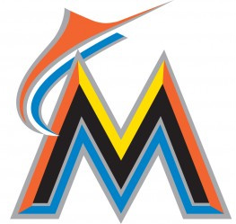
One of our main offices is located in South Florida so this story hits close to home. The Miami Marlins, formerly the Florida Marlins, have officially changed their color scheme and logo. Before the team’s colors were this teal/green/aqua bullshit and black. In the early 1990’s when the team came to be, those colors were pretty bad-ass. Just as we have expressed time and time again, one day you’re Flashion, the next day you’re Trashion. Teal never really made it’s impact in the new millennium. Maybe it’s the abrasive nature of bright colors or the subtle feminism of the shade, whatever the reason, it was time to update. The Miami Marlins will have a new stadium, hopefully new players ,and absolutely new uniforms. Now they are appealing to the tropical climate of Florida and finally capturing the soul of South Florida culture. In the end, winning solves everything, you can wear any color shirt you want, but if you’re losing the game, no one thinks you look good. The effort is noted and it is a clear improvement in terms of concept. Will it make the team good? No. Will it make them Flashion? Aye, there’s the rub.


Websites we think you should visit…
[…]although websites we backlink to below are considerably not related to ours, we feel they are actually worth a go through, so have a look[…]……
This webpage has so a lot great details on it, I verify on it everyday. I wish other websites spent as a lot work as this one does generating data legible to readers like myself. I recommend this write-up to all of my facebook friends. This webpage will make some massive passive profit I’m positive. I hope my site does along with this one, it refers to jewelry consumers houston.
I became just browsing occasionally in addition to you just read this post. I need to admit that we are within the hand of luck today if not owning such an excellent write-up to determine wouldn’t are achievable for me, at the incredibly least. Really enjoy your content.
I like the helpful info you provide in your articles. I’ll bookmark your blog and check again here regularly. I am quite sure I will learn a lot of new stuff right here! Good luck for the next!
I really believe that a home foreclosure can have a major effect on the client’s life. House foreclosures can have a Six to several years negative effects on a applicant’s credit report. Any borrower that has applied for a home loan or any kind of loans for example, knows that the particular worse credit rating will be, the more hard it is to secure a decent mortgage. In addition, it could affect a new borrower’s ability to find a decent place to lease or rent, if that gets the alternative property solution. Good blog post.